Spirit Airlines
Overview
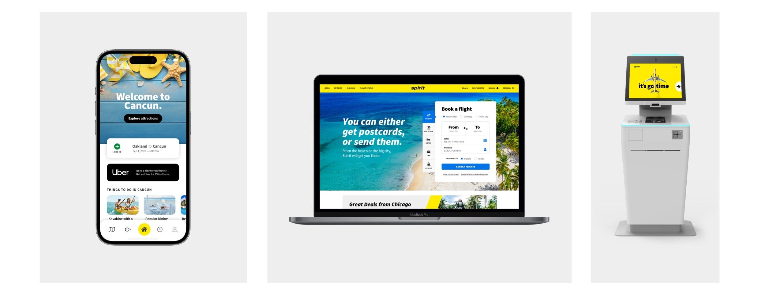
Spirit Airlines is a budget airline company known for its no-frills approach to travel. They focus on providing affordable flight options, often with additional fees for amenities and services. Our goal was to help Spirit optimize its digital experiences spanning from mobile app to kiosk.
My Role
I worked as a lead designer and was responsible for the design of new features and enhancements, along with contributing to the growth of the Spirit design system. My responsibilities included user research, concept generation, usability testing, and creating prototypes to achieve user and business objectives.

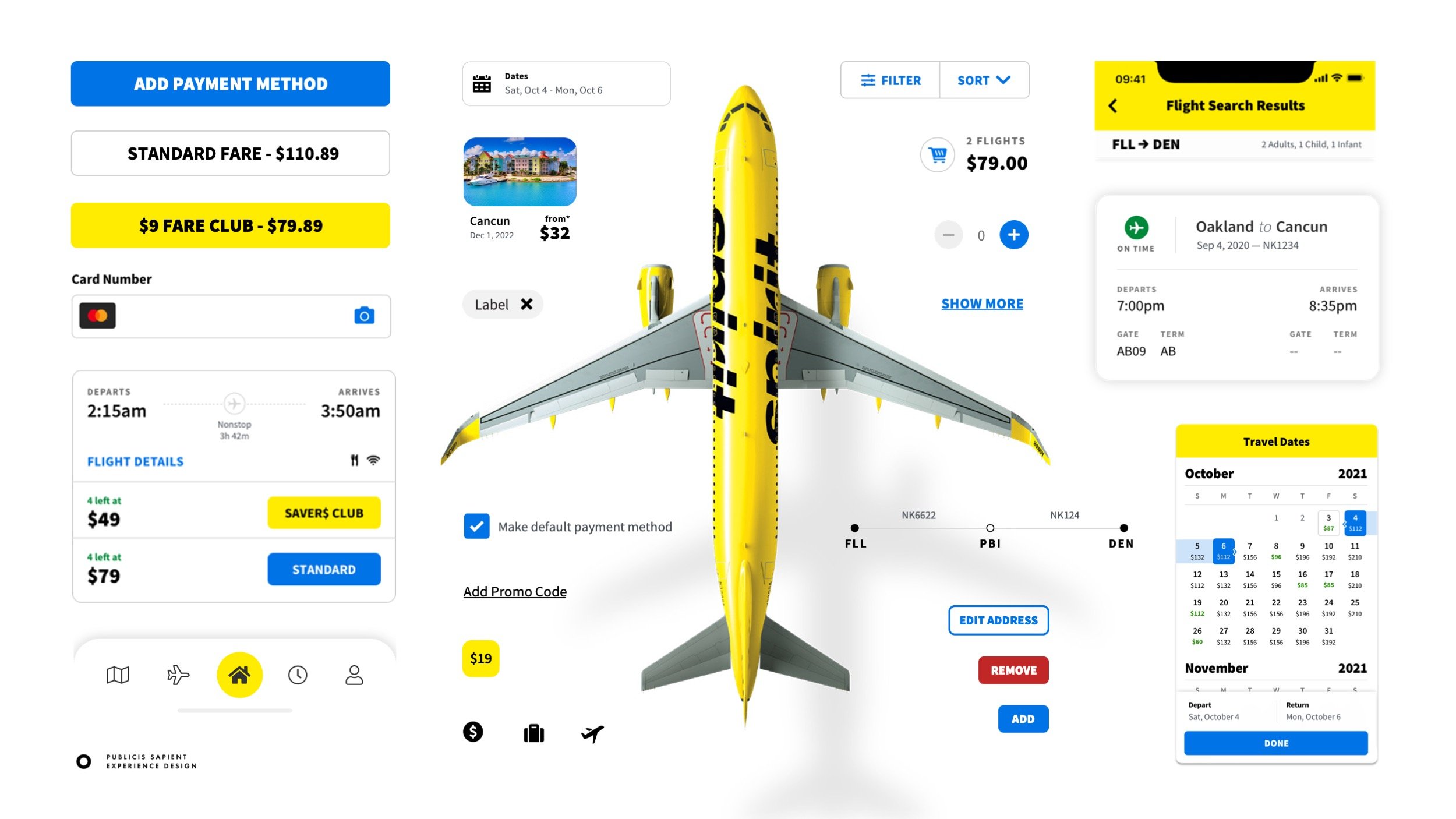
We started by building Spirit a global design system — that has grown to span multiple touch points including their native mobile app, web and in-airport kiosk experiences.
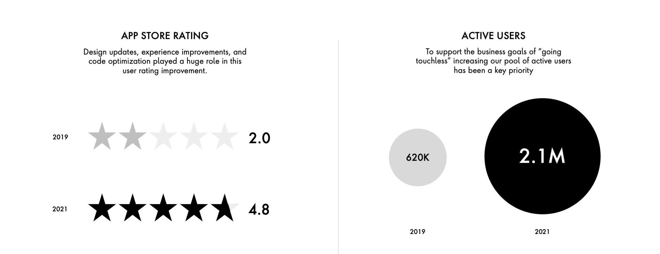
Next up was a redesign of the Spirit Mobile App, where we saw significant increases in ratings and active users post refresh.

We started with the home screen of the app, with the goal of creating an always updating design that served the guest’s needs at each step of their journey — following them from pre-booking to various stages post-booking leading up to the day of travel, in-airport experience, and post-arrival.
During this phase, I created wireframes, built interactive prototypes, and developed new components for the Spirit design system.
We conducted online and in-person user testing during to guide our design process.
A combination of remote and in-person testing provided rich insights to guide our design decisions. During this phase, I developed interactive prototypes in Figma and InVision in collaboration with our data team. We visited multiple airports to run additional tests, gathering feedback and conducting time trials.
User testing revealed key insights for optimizing the web experience
We started with the homepage and core booking widget, and moved down the booking flow one page at a time.
I led the design of different tracks of work within the web experience, primarily with the redesign of the seat selection flow. The goal of the seat selection redesign was to streamline the experience by minimizing the visual clutter vying for attention, in addition to finding opportunities for seat upsells.
The image on the right shows the experience prior to the redesign.Key Research Insights
-
Overwhelming Content & Navigation
There were many steps required to booking a ticket including many optional tasks that drew users away from the primary goal of completing their booking.
-
Lack of Pricing Clarity
A la carte pricing options allow guests to customize their experience to their budget and needs, but it can lead to confusion as the fees add up.
-
Seamless Travel Planning
Understanding the needs of how people plan and purchase for their travel so they don’t feel limited by the current experience.
Our redesign focused on providing clarity and minimizing distractions
We started with the homepage and core booking widget, and moved down the booking flow one page at a time (flight selections, seats, bags, options, etc), optimizing along the way.
I led the design of different tracks of work, primarily with the redesign of the seat selection flow.


